Comics and cartoons have always been closely associated with humor and satire. The nature of these mediums enable artists to flexibly depict absurdity since inserting absurd locations and characters pose no additional expenses during the creative process. Thanks to this, an independent comic book series, Jeff Smith’s “Bone” could win the most prestigious awards of the medium and become the comics equivalent of The Lord of the Rings with its massive story without spending millions. This paper focuses on the first two volumes of the series, and how it became a classic by using the techniques that are peculiar to the medium.
One of the most important points that make satire narratives powerful is the unexpectedness of jokes, when something funny or absurd is expected, it is not as effective as a suddenly thrown joke. Throughout the series, Jeff Smith frequently resorts to one powerful side of the comics medium, which is the effectiveness of sudden appearances in comics. Since comic books are read panel to panel, and showcase the “time” in a “discrete” (non-continuous) manner, readers have to fill in between the separate moments. This concept, which is called “closure”, is relatively simple and the brain works in an automated way in the cases where two consecutive panels include similar objects and characters. However, when something new and contextually unrelated is introduced in the following panel, it surprises the reader and engages him/her more into the narrative. Therefore, suddenness can be portrayed in comics better than other mediums.
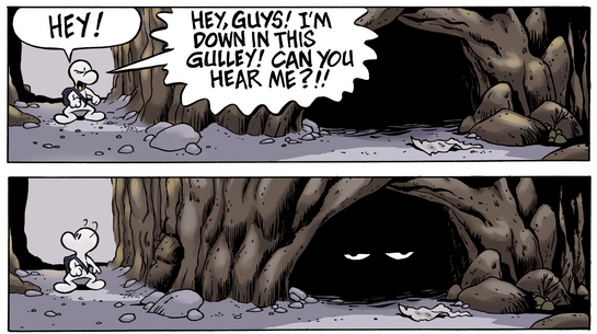
Figure 1. The Last Two Panels from the 13th Page of Volume 1
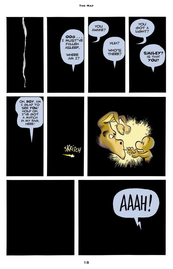
Figure 2. The 18th Page of Volume 1
Jeff Smith inserts these sudden appearances masterfully as punchlines in Bone just like “beats” in a screenplay scenario to control the pace of the narrative. In the last two panels of the 13th page of the 1st volume, this technique is used with the momentary appearance of The Great Red Dragon, also the first appearance of the character, who continues to appear in such ways throughout the narrative. Along with the humor, this character is also used in similar panels to remind readers the big picture of the story, especially in the parts where the micro-stories take over. The 18th page of the same volume is also a good example of this, in which timing is also depicted smartly with a blank, black panel to make readers feel the astonishment Fone Bone experiences.
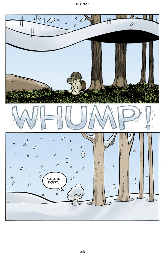
Figure 3. The 28th Page of Volume 1
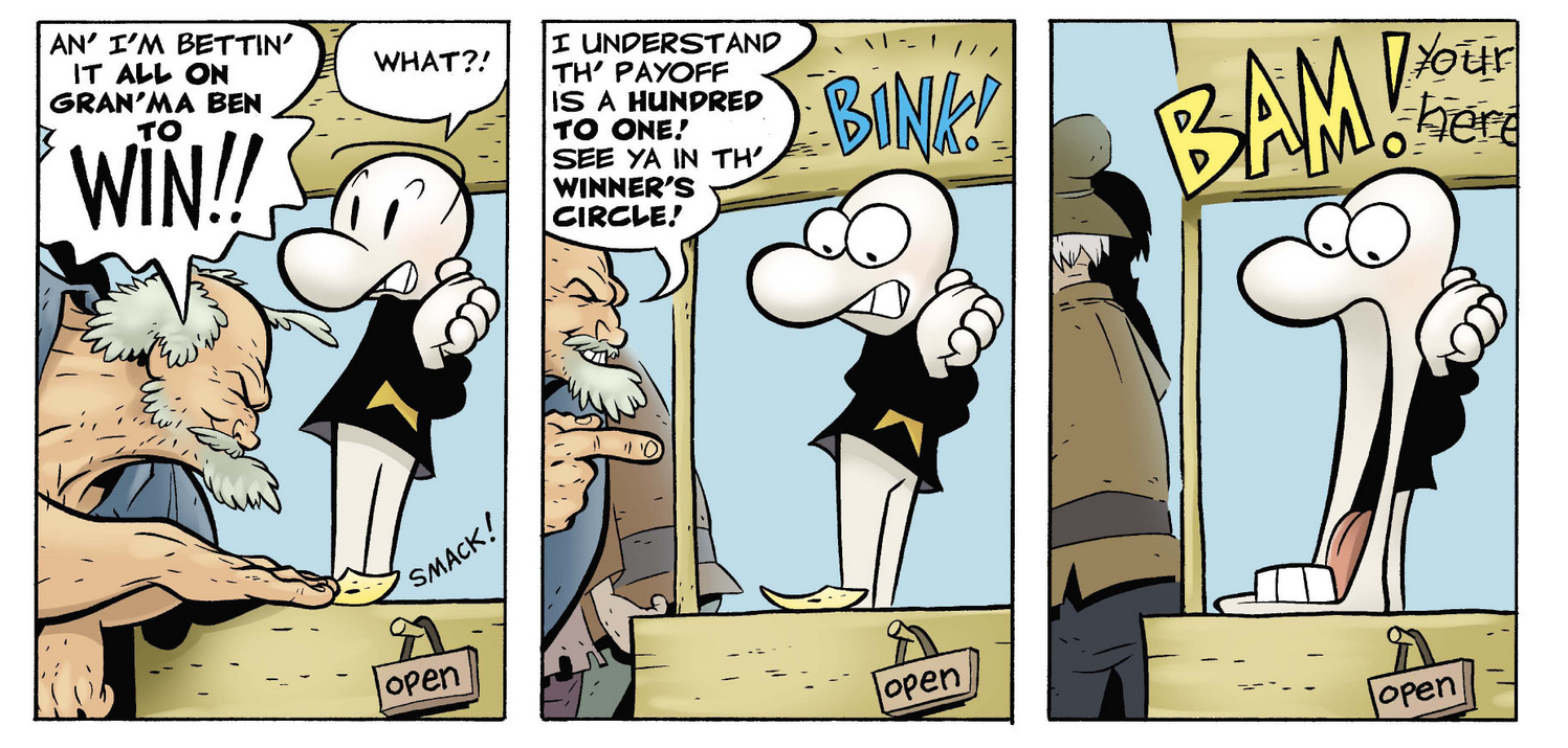
Figure 4. A Sequence from the 73th Page of Volume 2
In the 28th page, the technique is combined with the “visual exaggeration of real life objects and events”, which is also a comics/cartoon-only feature: Right after Fone Bone mentions that the forest is weird, a snow cover (literally a cover) falls from sky, expanding the suddenness concept to seasons. It is also used in the emotional switches such as in page 73 of the second volume, where we see a two dimensional pair of eyes on a Bone’s face for the first time, enhancing the element of surprise and strengthening the humor.
Another important feature of the series is that it can be readed as a parody of gender roles in popular culture. To create the contrast with the usual, Jeff Smith again makes use of the flexibility of the medium by creating characters with absurd bodies. In the narrative, main male characters are literally “bones”, rather than “muscles”, as we generally see in such fantastic stories. The female characters are depicted stronger, and rather than a muscular protective father, Thorn, the main female character, lives with an extremely strong and athletic Gran’ma Ben. This exaggeration is again confined to comics since such a character neither can be inserted into a movie (at least without spending hundreds of millions), nor it would be that effective in a novel due to the lack of her caricatured appearance and acts.
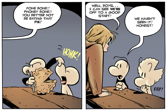
Figure 5. The 73th Page of Volume 1
Besides the unusual gender depiction, minimalist design of the main characters along with the deformations that occur to their bodies (that is similar to traditional cartoons, for example in the 73rd page of the first volume, the head takes the shape of the pie and Bones have eyebrows separated from their head) create an additional contrast just like in the Hergé’s caricatured character Tintin creates a contrast with the very realistic settings he is included in: They leave Boneville and move to “The Valley” where the characters are closer to the realistic side of McCloud’s pyramide1. This contributes to their foreignness to a different culture where people have different customs and use a barter system.
FA 490 - Advanced Graphic Novel and Comics
Boğaziçi University - The Department of Western Languages and Literatures
McCloud, S. (1993). Understanding Comics: The Invisible Art. (pp. 52-53). Kitchen Sink Press. ↩

